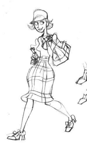

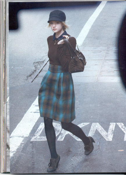
Time to start painting again. Here is the preliminary work for a new illustration. I found this DKNY ad in a magazine and thought it would make a cool girl picture. I need to do some more work on the skirt and to make sure that her pose looks natural. Any thoughts would help.
5 comments:
dopeness man!
the guy who is laying on the ground looks like he is lifting up a bit, watch for that, but overall it is looking good!
http://www.richardpose.com/stuff/IOGirl_RP.jpg
Hey IO... I did a quick fix up in Photoshop of what "I" think can be different...
I think the dead body should be in a different place, right now, its just a little too weird for the eye to follow that straight line down.... even if he were moved to the right, and not turned (how I laid him out) it might work better...
Otherwise I think the ellipses on the top of the girl's skirt needs to be fixed, and then the bottom I think so too... if her leg is pulling straight out, the skirt would have the extra material bilowing out, it would be pulled to the leg...
And then her hips, I took the hips out of the left side, and left the scrumptious booty on the backside... Only reason the DKNY photo has the hip poping is (Like Mike W said) cause of the weight transfer...
Hope that wasnt too much.. sorry but I am in a crit mode tonight..
Thanks, the guy looks better there, the ellipse too. Back to work.
nice piece! good comments Dik! Over all, it's really great!
Cheers!
dee
Think: more shadows! On a photo it might not matter, but we artists must give the picture more contrast and depth - or else the objects look like floating. The concrete looks darker towards us. I would also like to see some shadows on her skirt.
I really liked your take on this criminal babe: especially, the facial expression.
Keep it up.
Post a Comment